Behind the scenes of a book launch
A couple of weeks ago, we launched the Lean Analytics website. Since we’re writing about lean analytics, we figured we should probably track a few things along the way. In the interest of transparency, here’s what we did and how it went.
Creating the site
Our first step was to create the website. We did this with the help of Nudge Design, a designer who knows WordPress really well and was able to turn things around quickly. We had to work fast, because Ben’s company had completed its recent acquisition by Salesforce and Startupfest was around the corner.
Setting up analytics and goals
We put Google Analytics into the site, and set up a couple of goals. These were simple enough. We wanted to know how many people would:
- Click on the book cover to find out what an MVC was.
- Sign up for our mailing list. (Come to think of it, you should probably do that now.)
- Complete our brief survey to tell us about themselves.
Here’s what we configured in Google Analytics:
Note that we couldn’t easily track mailing list signups, since they happened elsewhere. We also configured the survey completion goal half-way through the launch; more on that later.
Generating tracking codes
We planned on telling some of our friends and proponents about the book. These are people with big followings: Tim O’Reilly, from our publisher; Eric Ries, the Lean Startup founder and series editor; Avinash Kaushik, arguably the smartest (and most irreverent) person in analytics; and Julien Smith, a Montrealer and bestselling author.
We also wanted to use our blogs (Solve for Interesting and Instigatorblog) as sources for traffic, as well as two events we’d be speaking at (Startupfest and Lean Startup Machine.)
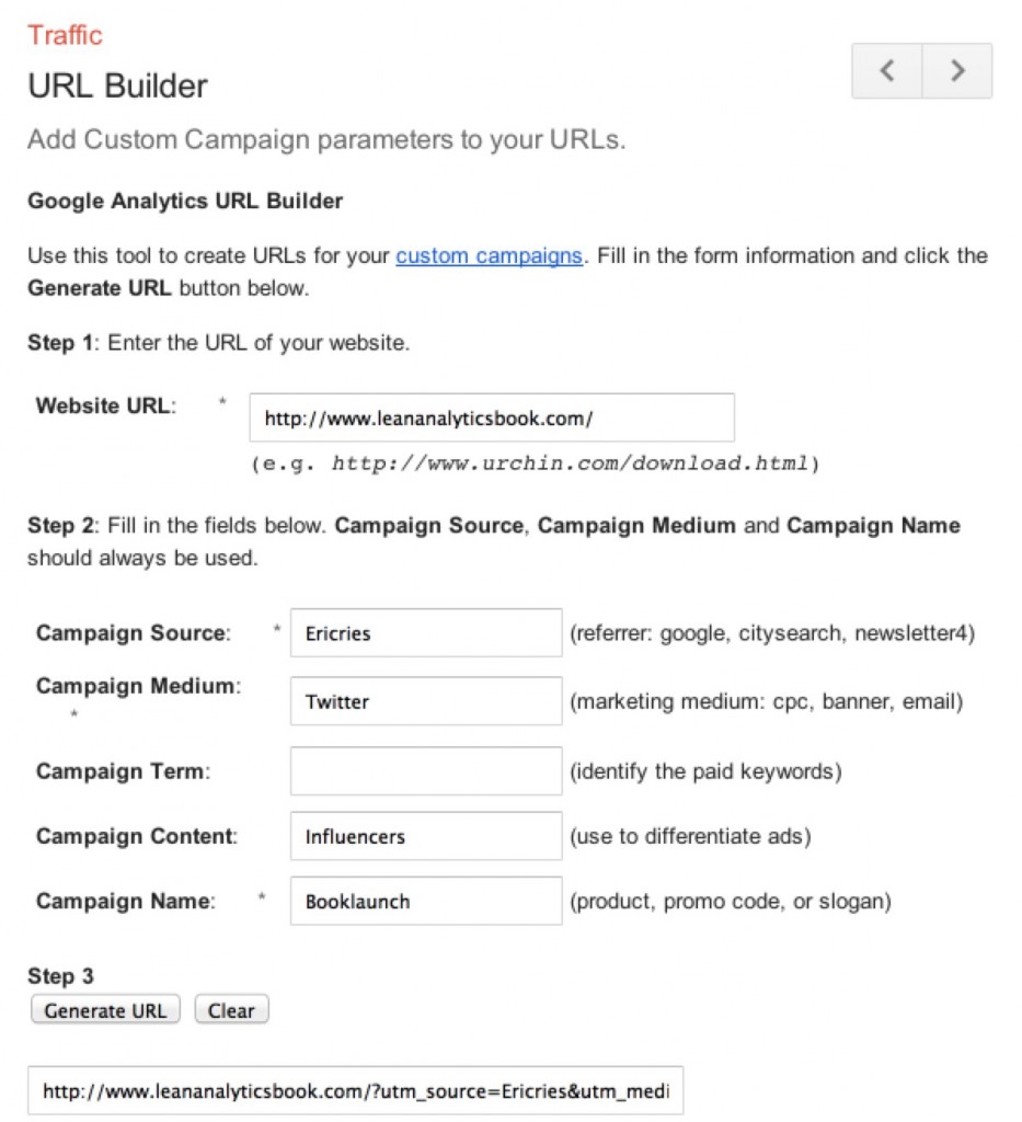
Tracking all of these mentions across the “long funnel” from the first mention to the eventual visit is accomplished by embedding tags in the URL. Google has a page that helps you build these tracking URLs, allowing you to segment visitors by source, campaign, and so on.
The tags help distinguish visitors by their source, the campaign used, the medium, and so on. We didn’t want to burden our proponents with too many codes, but I did generate some codes for myself which identified different media (LinkedIn, Twitter, Facebook) to demonstrate how it works.
Generating short URLs
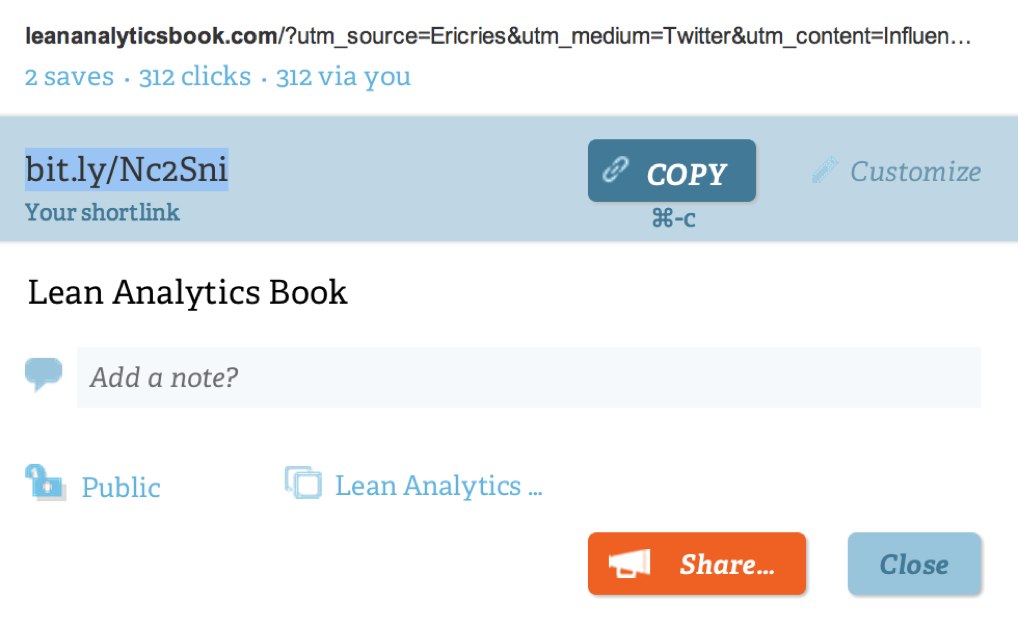
A long URL from Google’s tool won’t fit easily into social media platforms. Plus, it looks messy and it’s hard to remember. So we needed to shorten these, which we did by generating short URLs with bit.ly.
For many of the shared URLs, we just used the default random string of letters that bit.ly gave us, but for some of the events we generated custom ones that were easy to remember. For example, in my presentation on coefficients of friction at Startupfest, I used bit.ly/Leanfriction in my closing slide.
Giving the codes to famous people
Armed with these codes, we sent them to our proponents, and they mentioned the site to their followers. The race was on: who would generate the most traffic? Who would send us the most completed surveys?
We could have overwhelmed these proponents with too much tracking data, but that’s too big an “ask.” Giving them a single URL to mention is good; in fact, the less work, the better. I’ve run campaigns in the past where we actually gave each proponent a calendar invite, so they’d remember to do the thing we asked at the time we asked. Famous people are busy; you have to make it easy for them wherever you can if you want their support.
Watching the results on bit.ly
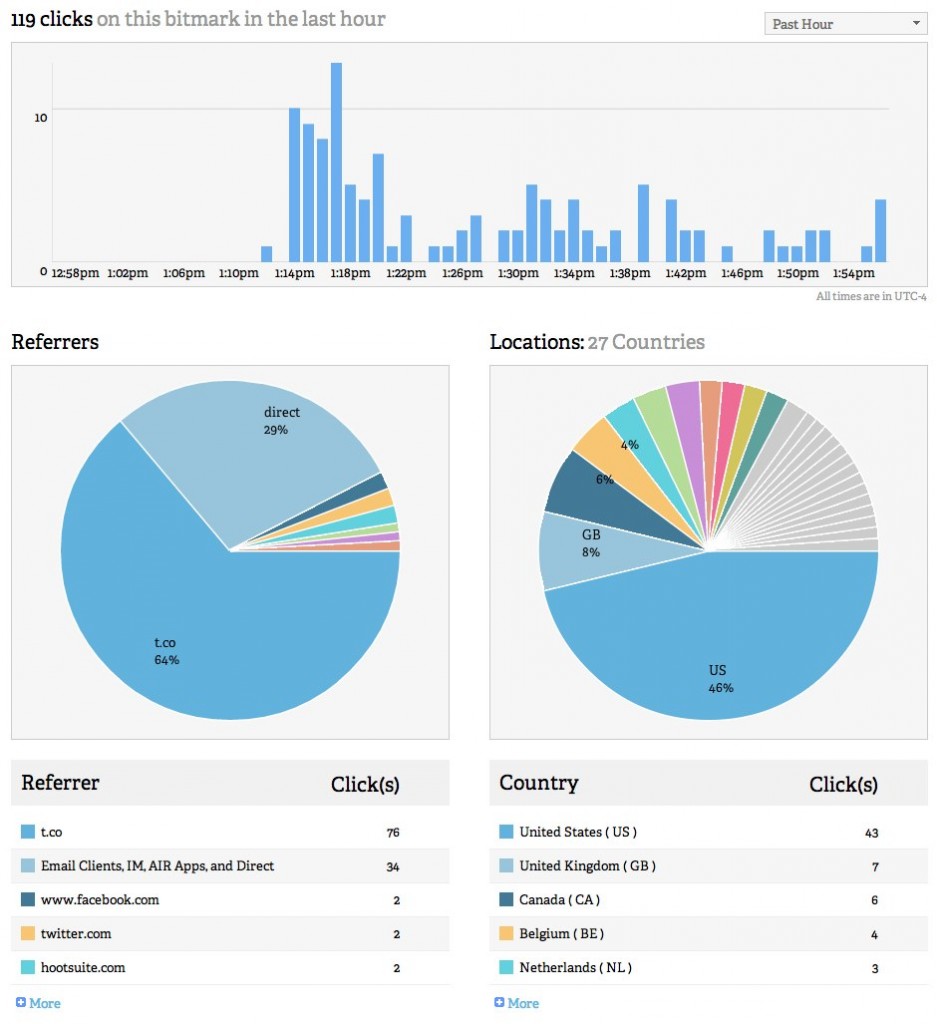
Bit.ly provides some detailed information about the way short links are shared, so we were able to see how each proponent’s URL spread across a particular medium. Here’s Eric’s mention spreading across Twitter on the day he announced it.
Note that we can also tell some things about how his audience interacts with content—some use Facebook, some Hootsuite, and the vast majority came through Twitter’s shortened URL (t.co) which in turn encapsulated our bit.ly URL.
Watching realtime on Google Analytics
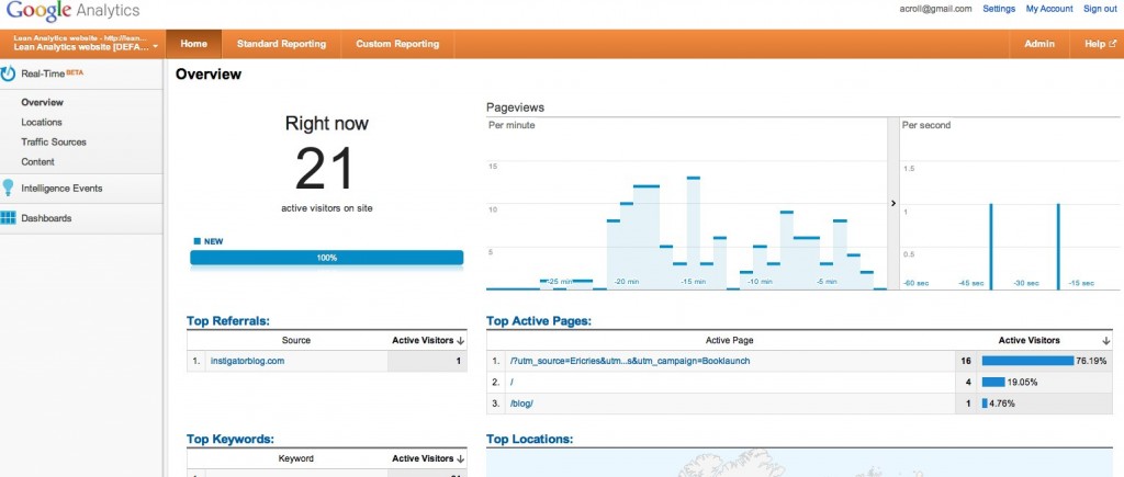
Google Analytics has a beta feature in which realtime traffic scrolls across your screen. Here’s what we saw on the receiving end of Eric Ries’ mentions. Note that any shortfall (people who clicked his link, but for whom we didn’t see a visit) is an indicator of problems with the site (slow loading, for example, may cause someone to cancel their visit before the page loads.) This is known as the sessions to clicks ratio.)
I’m not sold on the benefits of realtime data unless you can react to things in realtime, but it is a good tool for seeing if you’ve got something hideously wrong (such as the wrong landing page in a link) so you can go fix it. Plus, it’s fun to watch.
Seeing the Facebook page traction
We also set up a Facebook page. Once it hit 30 people, we had access to some stats on traffic and growth.
Facebook doesn’t give you a ton of data, but it’s enough to see whether traction is growing and to know how big your reachable audience is.
Join us on Facebook »
Traffic to our own blogs
Ben and I both wrote posts about the book on our own sites. I created different URL tags for Facebook, LinkedIn, and Twitter, turned these into three different URLs, and used a different one on each social platform. The results show me how useful each of the three sources is for traffic to the site.
Note that this is traffic to the Solve For Interesting post about the book, which in turn links to the book site. As such, it’s part of a long funnel that begins with a tweet on Twitter; leads to this page; and then (hopefully) sends traffic to the Lean Analytics book site.
Seeing the Mailchimp traction
We use Mailchimp to track our mailing list size, as well as to manage subscriptions, opt-out, and other aspects of staying in touch with our readers. Mailchimp provides charts and data on signup growth.
Once we start sending out messages and posts, Mailchimp can measure things like unsubscriptions, bounce rate, and so on. When we first sign up subscribers, and clean up junk email addresses, we don’t know how many of those 572 subscribers are actually useful.
And by the way, if you haven’t already, you should probably sign up for the mailing list and take the survey. The form is over on the right, at the top of this page. Go on; we’ll wait.
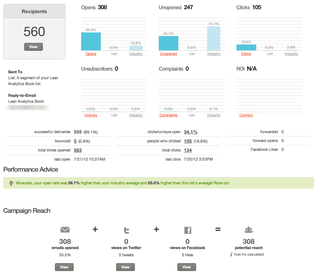
Once we sent the first blog post to the mailing list, we had a better idea of our list quality. Here’s mailchimp’s dashboard for a mail sent to all the people who asked to receive blog updates.
Our open rate was 55.5%; the industry average for our industry (“consulting”) is a paltry 15.8%. And Mailchimp thinks we can actually reach 308 people as a result of all this work. We’re not currently using Mailchimp for other platforms like Twitter or Facebook, though.
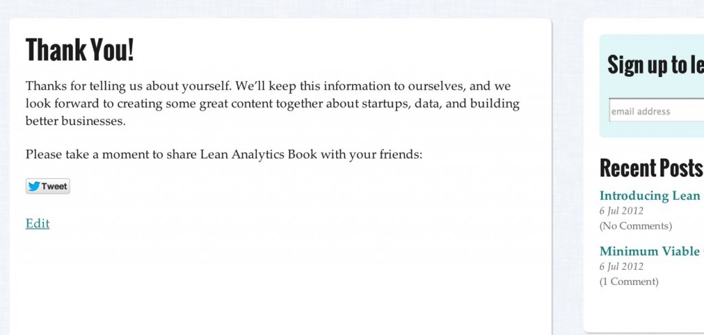
At this point, we have to confess to something: we didn’t track survey completion properly. We use Wufoo for our survey, and only the paid version is able to direct someone to a separate page on completion of the survey. We’re cheap bastards, and hadn’t paid for this, so half-way through the launch we realized the error of our ways, turned up the forwarding feature, and sent respondents to a thank-you page.
This matters because the only way we could easily track survey completion was when someone came back to that page. We should have generated Google Analytics “events” when someone put their cursor in the signup box, and embedded an event in Wufoo when someone filled out the survey. We could even have used a tool like Clicktale to understand which fields in the form weren’t being completed. Our bad.
What it means is that some people who mentioned our book later in the launch process (Avinash, Julien) look like their followers are more likely to complete a survey than those who mentioned it early on (Tim, Eric.) It’s not their fault; it’s ours. This should underscore the challenge of Getting Your Shit Together First.
Setting up a Google Analytics dashboard
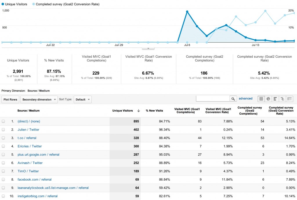
Finally, we set up a custom report in Google Analytics to compare traffic, survey rates, and the effectiveness each proponent had on our goals. We have data on pretty much the whole campaign; and we know who we have to buy drinks for, and whose blog generates the most traffic.
Some things we can tell from all this:
- Julien had a tremendous number of followers visit the site (and Chris Brogan, his co-author, helped spread the word) but relatively few of them completed our survey compared to Avinash’s followers.
- Eric Ries’ followers were much less likely to wonder what an MVC was and click on the picture of the book than Tim’s were.
- “Uninvited” visitors from Twitter and Facebook clicked on the MVC picture, but Twitter users were far more likely to finish the survey.
- Ben’s blog drove some traffic, but mine didn’t even make the top ten. Sigh.
- Google Plus drove traffic our way, mostly due to Tim O’Reilly’s use of it; LinkedIn mentions didn’t drive anything.
- It turns out the Facebook page did in fact generate quite a bit of traffic to the site.
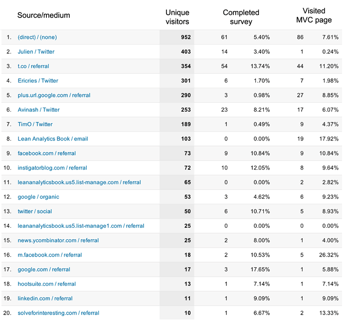
And so on. Here’s a second custom report, which compares the unique visitors and goal completions to the referring URL.
Sadly, of the 99 people who followed links to Solve For Interesting (see “traffic to our blogs” above) only ten clicked through to the book site; and of those, only one completed the survey. Ben, on the other hand, had eight people do so. In other words, Ben’s followers are eight times as likely as mine to complete an online survey. Ouch.
Finding the unknown unknowns
Avinash likes to point out that Donald Rumsfeld was an analyst.
There are known knowns; there are things we know that we know. There are known unknowns; that is to say there are things that, we now know we don’t know. But there are also unknown unknowns—there are things we do not know, we don’t know.
Known knowns are simply facts we regurgitate (time on site.) Known unknowns are simply analysis we perform based on things we already believe are important (“which sites send me the most traffic?”) But it’s the unknown unknowns that really matter, because that’s where the magic comes from. Here’s a great session from him at Strata earlier this year.
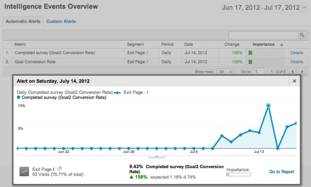
Admittedly, we have a very small site and a very small amount of traffic. Right now, it’s enough to go through by hand. But as it grows, having the system tell us what’s interesting is critical. Here’s an example of Google Analytics’ “intelligence events”. Basically, Google forms an opinion about what it expects to happen, and then tells us when that opinion was wrong—when something was unexpected.
In this case, Google expected 1.18 to 4.74% of visitors to complete the survey, but on the 14th, 9.4% of visitors did so. We can then drill into this to see what provoked the change. (Note that we’re lying a bit here to make a point—the increase in exits from this page was almost certainly due to us changing the survey landing page halfway through the launch process. But the point is still valid: often, the most interesting thing that happens is a deviation from your expectation.)
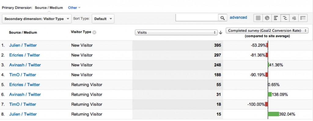
One more piece of eye candy: We can further segment visitors by other dimensions and find out more detail. For example, when we split our four proponents’ traffic into new versus returning visitors, we find out that Julien’s returning visitors are much more likely to complete the survey.
(Again, these results are skewed because Tim and Eric didn’t have the benefit of the survey landing page to track the people they sent. We have 572 people in the mailing list, but only 186 visits to the survey landing page—clearly, Tim and Eric were responsible for a whole lot of survey enrolment. But you get the point.)
So what?
Right now, the thing we care most about is the followers and survey respondents we have. We want people’s attention (and nearly 3,000 of you have visited the site, so that’s good.) But we also want the permission to reach out to you in order to ask you questions, send you updates, and ultimately, have you buy the book or pay to see us speak. For us, that’s the One Metric That Matters.
We know, from this data, that we should work on Facebook, Julien, and Ben’s blog for traffic. And because we know which people sent us posts, as we write things we’ll learn whose followers like what kinds of content—which means we’ll be able to ask different proponents to promote different content based on what their followers seem to like.
It’s early days for the blog, but we’ve got a pretty solid foundation in place with which to understand our audience in the coming months.
Putting it all together
 We put all of this together into an infographic. It’s awesome. But we want something in return. We want you to sign up.
So put your email in the signup form below, and we’ll send you a beautiful, informative, no-holds-barred look at the campaign from start to finish.
You’ll also get future updates from us, and a bunch of chances to participate in the creation of the book by sharing your stories, taking surveys, attending regional events, and more.
Note: If you’re already a subscriber to our list, we’ll be sending the infographic in a couple days.



 Follow
Leave a Reply