Freemium and the feature/business tension
Ben pointed out this week in a great post that the key to success for many businesses is to convince users to adopt a tiny, new, addictive behavior. This is essential for the stickiness phase of a company, because it’s what keeps people coming back, and using your product, from which you can then learn and experiment.
But as startups transition from stickiness (what users want) to revenue (what the startup wants) they often face a fundamental tension between usability/addictiveness and money/onerousness. That’s because keeping the money flowing sometimes means not making the users happy. While this might seem obvious, it’s behind much of the hand-wringing and analysis-paralysis of growth. It’s a really hard balance to strike, and it’s one of the reasons startups with good stickiness and virality fail to make it to revenue.
For free B2C applications, if you’re not paying for the product, you are the product. This is certainly the case with social platforms. Facebook pays for all your Likes with advertising revenues; Twitter sells your stream of Tweets as a firehose for others to analyze.
You often can’t do what you want on a free platform. Try mailing someone a link from Facebook on a mobile app. First, you have to open the link in an external browser to get the URL. Sharing is a critical KPI for Facebook, and this is one way to make it harder to do elsewhere.
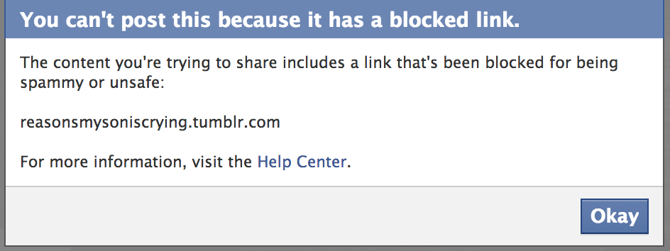
Facebook has a number of ways to limit your ability to share. For example, it can block content in subtle, even insidious, ways to prevent it spreading.
Is Tumblr really spammy or unsafe, as Facebook suggests? Certainly, the company would prefer that sharing happens on their platform.
This kind of functional jerrymandering isn’t just limited to free B2C applications. Even paying for something is no guarantee of a good experience and you likely still are the product. Getting the functional balance right is a fundamental challenge for startups that use the Freemium model of customer acquisition.
Consider expense reporting service Expensify. I love it. I rely on it. I recommend it to people all the time. But the UI by which you upload, crop, and rotate receipts you’ve scanned is atrocious. So the product metric that you’d care about in the stickiness stage—usability—is bad. If you’re curious, here’s a quick video of me trying to rotate and crop a receipt.
On the other hand, Expensify makes money from a scanning service where, rather than you having to do it yourself, they charge you a small amount to do so.
A strong business metric (revenue from expense report scanning) is encouraged by a weak product metric (frustrating usability).
If you’re a product manager, that sucks.
This is a natural tension. It happens in all product categories. For example, the LinkedIn app for iPad is beautiful. But when you’re reading a story in it, you can’t copy a link to the iPad clipboard. This aggravates me, but it’s a price I’ll pay to play within LinkedIn’s walled garden. For LinkedIn, this is a way of keeping sharing and interaction within their application, encouraging shares within LinkedIn itself rather than, say, on Twitter or email.
A strong business metric (in-network interaction) is encouraged by a weak product metric (crippled sharing functionality).
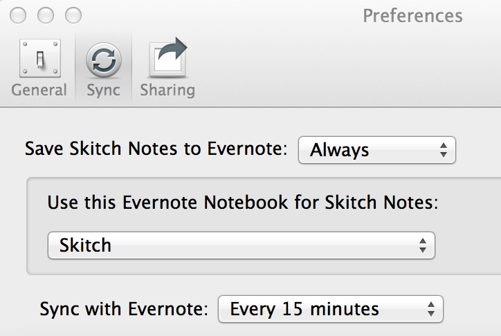
Evernote is another example. The company wants users to bump up against its maximum free storage threshold so they’ll upgrade to a paid version of the service. That’s why they acquired screen-snapping tool Skitch. They removed a number of features from Skitch when they acquired it, changing how the tool ran. They also added synchronization with Evernote—on by default, of course.
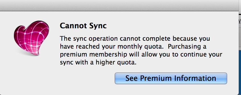
This means that, towards the end of the month, you start getting warnings from Skitch saying it couldn’t sync its images with Evernote. Each of those warnings is a chance to upsell Evernote users—but it quickly becomes an annoyance, making users save images selectively rather than automatically.
A strong business metric (upgrades to paid accounts) meets a weak product metric (nagging reminders and interrupted workflows).
In the Skitch case, what Evernote did prompted an Engadget post recommending the best screen-capture replacement to its readers.
LinkedIn, Expensify, and Skitch aren’t B2C applications. But they are freemium products, and they all need to balance product joy with occasional nudging. The next time you’re building an application, or using one someone else has built, take a minute to consider what constraints the designer is working with. Many of them are a function of the business model, rather than look, feel, or usability.
As we mention in the book, Freemium is a risky customer acquisition tactic for a number of reasons, and only works for certain business models and usage patterns. Before you decide Freemium is right for your startup, you need to understand the risks of intentionally frustrating your users.
Great products strike a balance. They make users eager to pay for the service in order to support it, rather than extorting money for features the users feel should be included. This is a real art: too onerous, and you alienate users; not tough enough, and you can’t force people to upgrade or pay in the way you hope, and your business can’t pay its bills.
Now it’s your turn: what metrics do you think a startup should employ to strike the right balance?


 Follow
Leave a Reply