Seven onboarding mistakes you don’t want to make
 Recently, Bayram Annakov of Appintheair wrote to us about how he’d used analytics and Lean approaches to improve his user onboarding, with some pretty dramatic results. He was kind enough to outline them here for all of us.
We build great apps, we solve critical problems, and we help our users achieve their goals. But you know what the real problem is? Despite all that, sometimes users simply don’t use our product—because we failed to get them on board. All that hard work goes to waste.
Here’s my hit-list of top mistakes that app developers make in onboarding:
Requiring that users register too early
Don’t force the user to register. Delay until it is absolutely necessary, or you risk losing them entirely. Allow them to skip registration, but ask for it when user takes some action. For example, iTunes invites you to register when you click “Buy.”
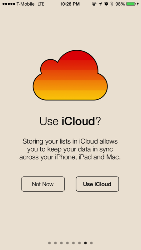
And when you do ask them, be sure to explain the benefits of registration, such as backing up their data or syncing between their devices.
Explaining the obvious
Get out of the user’s way. Literally. Don’t force them to watch ten slides just to explain how to use a calculator! Instead, show the interface and make it intuitive.
Grabbing for push notification or address book permission
I know getting permission to contact users is very important for retention. I know you want to spam notify users to make them come back to your app. But hey—if you really want the user to give you their permission, don’t ask them on the app’s first screen. Explain why you need it using a custom dialogue (iOS does not allow customizing permission text—that’s why you need to implement your own screen).
Or better yet, make the user perform an action that signals her desire to give you permission. Banking apps are a great example of this: You really want to get notified when any transaction is done with your credit card, so they likely have a very high notification permission acceptance rate at this stage.
This is what we do in App in the Air: we ask for push notification permission only after a user demonstrates his/her desire to receive flight status alerts.
Look how Snapchat prepares the user for address book permission. First, they explain why they need access:
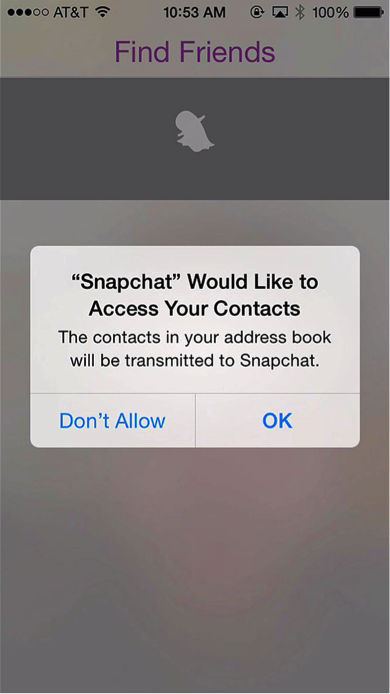
Then, with this context, they hand things over to iOS to get the authorization:
Displaying all instructions at once
Some apps have a bad habit of displaying all their instructions and hints on a single, overwhelming screen. It’s far too much information, so the user remembers none of it—and gets the impression that the app is complex or hard to use. Instead, reveal yourself as they use the app. Teach one thing at a time and let the user learn by doing.

Above is an example of how one feature-rich task management application achieves this.
Not giving them an option to skip
Users sometimes re-install the app, whether they’re purchasing a new gold iPhone 6, or just recovering from a backup. Whatever the case, you want to avoid annoying an expert user with your hundred-page tutorial. Let them skip. Save them time and they’ll thank you.
Displaying empty screens
Please don’t ever display empty screens to the user. Josh Elman, former product lead for growth at Twitter, calls this the the “totally awesome blank screen of death.” Provide instructions, test thoroughly with edge cases, and make sure you avoid the kinds of empty screens that alienate and frustrate users.
Not measuring onboarding
This is perhaps the most important step, and the one most closely tied to Lean Analytics. It’s not enough to measure clickthroughs, or calls to action, or downloads. Your job isn’t done until your user has reached a point in their engagement process where they’re using the application as you intended.
Measure the number of users who successfully pass onboarding. Investigate why users drop, and tirelessly optimize the experience as much as possible. Remember, if your user can’t make it through onboarding, she won’t understand the power and functionality of your application. She definitely won’t use it, and you’ll miss the key leverage in growing your app to millions of users.
Our experience
For AppInTheAir, fixing these mistakes helped us move the bottom of our funnel—onboarding conversion rate—from 50% to roughly 95%.
Josh Elman agrees—he thinks Twitter’s new onboarding process, which he covers in this video, is the secret behind Twitter’s growth from 10M users to 100M+ daily users: They taught users how to use Twitter without annoying or alienating them along the way.
Here’s some extra homework: check out this great compilation to see how popular web and mobile apps handle their sign-up experiences. Snapchat, in particular, works hard to make signing up not just smooth, but fun.
 Follow
Leave a Reply